Showing posts with label Ugly Uniforms. Show all posts

Monday, July 28, 2008

Greed is ... good?

OTTAWA: A dramatic change in the Senators' third jersey will see a predominantly black uniform with the word 'SENS' angled upward on the front. A fashionable red stripe will run from the arm pits, down the side of the jersey, to its base, where the stripe turns inward. A pair of narrow red and white stripes will adorn each arm, and the very bottom of the jersey. It’s quite a sharp design." -- Howard Berger, FAN 590
Credit where credit is due: The Leafs avoided any sartorial snafu. This is an out-and-out cash grab, but let's be fair, NHL teams, like Brandine on The Simpsons, have to wear what RBK gives them. If that means introducing third jerseys that, in some cases, are basically copies of the sweaters teams wore in the '70s and '80s, so be it.

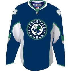
Also of note: Bucholtz's Vancouver Canucks are bringing back their original 1970-71 jersey, the one where the "original 'hockey-stick-in-a-rink' logo is outlined in green and white on the front."

(Link via Puck Daddy, which was nice enough to link us today!)

Thursday, July 17, 2008

Will Leafs have a third jersey for all their third-line players?

It would be a far better thing to talk about two sweater designs for the much-needed second NHL team in Southern Ontario than a third sweater for the Toronto Maple Leafs.

There was a passing reference here last week that the NHL wasn't satisfied with already having got fans to shell out for the RBK Edge jerseys that all 30 teams introduced last summer. Talk that about half the teams will break out a third jersey this fall is starting to pick up (they're waiting for the official announcement). On gut level, this comes across as greedy, the latest instance of pro sports viewing fans as ATMs with ears.

This all comes down to whether or not you're satisfied with the state of your team and the game. Winning changes everything. You wouldn't have such a sizable outcry about the Rogers Centre caterers firing a beer vendor for the flimsiest of reasons if the Jays were 10 games better than their 47-48 record (although the proof that people are right to rally to Wayne's defence is obvious iby the mere fact that Paul Godfrey won't go near it. Maybe Wayne should have sold beer to 20-year-old Red Sox fans from Boston without IDing them -- he'd have probably got a raise).

The Leafs are at best two, three years from being watchable again. Hockey is still too much of a defensive game (it's better than before the lockout, but that's no stardard at all). Ticket prices remain out of reach for the average fan in most Canadian NHL cities. A large handful of U.S. teams are hemorrhaging money, but hey, commissioner-for-life Gary Bettman would rather let an alleged white-collar criminal into the owners' den than Jim Balsillie, who would -- the nerve! -- try to put a team where people might actually pay the going rate and then some for tickets.

Throwing another overpriced jersey into the mix just pushes the bile a little more. It's ust another indicator that economic model of pro sports, in which you pay through the nose to show how much you care -- or have to act like you don't care, which has often been the case for this Leafs fan since about January 2006 -- is broken.

It won't change unless people keep raising a stink and refusing to stand for this, but it might be too soon to hold your breath on that front. Speaking as the proud owner of a Blue Jays powder-blue throwback, I know all too well the perils of a weak sales resistance. In fact, at this writing, I'm wearing the jersey.

Getting back to the point, why do NHL teams need to add another jersey? What's wrong with Chicago's iconic insignia, which was good enough for Bobby Hull?

This is something that is best left alone. The NHL doesn't get it. People, especially the folks in the United States who have hockey served to them on a silver platter and still sent it back to the kitchen, aren't going to start watching a sport because of snazzy uniforms. Coincidentally or not, the four four reigning champions in the major North American leagues -- the Boston Red Sox, the NBA's Celtics, the New York Giants and the NHL's Detroit Red Wings -- each wear the same uniform that that they did for generations. The Red Sox did have a different look in the '70s and so did the Giants in the '80s and '90s, but don't miss the point: They went back to the originals.

There's no sport in North America that inspires such fanatical loyalty as college football, especially in the Southern states. The last anyone checked, almost every major program has had the same look for decades (although Michigan is making a slight change this season).

Getting back to the Leafs: True to form, the jersey that's appeared on the team website doesn't look all that different from the current model, except for a lace-up collar and different striping on the sleeves.

Was there any great clamouring for the Sens or the Leafs to add another sweater when they just tweaked them 12 months ago? Why not just go all the way and have 82 different jersey, helmet, pants and sock combos, one for each game in already too long season? It would cause an uproar, but at least it would be honest.

(Digression:While we chalked up MLSE letting Leafs fans attend a game as a win, Puck Daddy is calling it a desperation play. One difference between the Leafs and the Jays is that with 81 home dates and 50,000 seats, instead of 41 and 19,500, makes it more obvious that a team and its league has lost its market share.)

This might have the air of that Seinfeld where George tells an actor from Cheers, "I don't want to tell you how to run your show, but enough with the bar already," but what the hell. The Leafs aren't allowed to introduce a third jersey unless it does away with the leaf crest (either version) and employs a colour scheme beyond the traditional blue and white.

They wouldn't do it, of course, because it would be messing with tradition. It's odd how that only gets invoked when it's convenient.

(Sites such as Icethetics do a great job tracking this subject, if anyone is interested.)

Sunday, July 13, 2008

3 years after the lockout, right back where we started from

The latest on the Boots Del Biaggio debacle makes it feel like the NHL's been taken all the way back to the mid- to late '90s.

It's the whole package: Roguish ownership, the prospect of yet another expansion no one asked for -- unless the team is being placed in Canada, then we'd all be for it -- and maybe even alternate jerseys. Ticket prices, as ever, remain almost beyond the reach of what any honest person can afford, but that goes without saying.

The Boots bombshell from this morning is that he basically tried to woo investors in the Nashville Predators by assuring them that the team could be moved -- which, if that's true, makes Gary Bettman pleading ignorance over the whole matter look even more abject. Greater minds have already pointed out that the revelations over these shenanigans only cover up something that might even be more scandalous:


"Included in the Nashville Group's projection of the team financials going out to 2011-2012 is a footnote alongside the team revenue estimate for the 2010-2011 season which says, 'Assumes a $15.0 million expansion fee received.' Gentlemen, start your speculation!" -- The Forechecker
Damn. At 15 mil a team, that works out to $450 million US in expansion fees -- probably two new teams. Adding expansion teams in a league where a good-sized handful of U.S.-based teams are really struggling -- with the way the U.S. economy is going, even the Pittsburgh Penguins, coming off a Stanley Cup final run, aren't on too sure a footing -- is really grating.

Related:
Del Biaggio investors want answers (Brandon Bailey and Pete Carey, San Jose Mercury News; via Mirtle)
Del Biaggio planned to seize, move team; Local owner says contract protected Preds (Brad Schrade, The Tennessean)
Forget the Del Biaggio drama, is NHL expansion on the horizon? (Dirk Hoag, The Forechecker)
Truth about Boots Del Biaggio: He was ready to move Preds (Puck Daddy)

Wednesday, June 11, 2008

Burned into the retinas...

Some anonymous editor at The Score deserves to take a victory lap around the studio today.

During a clip on Trevor Linden's retirement announcement, it ran a string of about eight or nine shots from his playing career. In every single one of them, Linden was wearing a different uniform -- but each one belonged to the Vancouver Canucks.

It's not a news flash that the Canucks have changed their uniforms quite often. By unofficial count, Linden would have worn 12 home and away sweaters across the 16 seasons he played in Vancouver. Rihanna should have had so many costume changes.
Crazy. Until last night, the memory of the Canucks' red third jersey from the mid-'90s had almost been erased. Looks like it's going to take more electroshock therapy.

Monday, December 03, 2007

JAYS GET AN EFFIN' A FOR UNI SWITCH

Instant verdict on the new Jays uniforms:
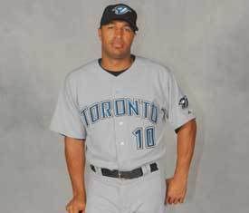
The road jersey (new block lettering, instead of Toronto written in this script): Like the re-signing of John McDonald, this is a halfway measure. The new kit the Jays adopted in 2004 was Paul Godfrey's attempt to put his stamp on the team and fans pretty much rejected it the road version. You didn't see many of the grey jerseys at games.

This is better... one quibble is that the new lettering looks way too much like that of the Washington Nationals, which is a classic bit of Toronto-centric thinking from a team that should be trying to bring in the abandoned Expos fans. It's a bit derivative.

It looks like it was decided upon by a 6-3 vote in the Jays marketing department. Such is life for a newish franchise. At least the lettering and numerals actually make use of the colour blue.

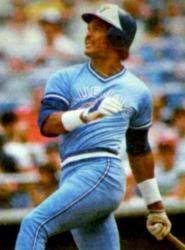
The powder blue alternate jersey: Effin' A. The Jays actually went their own way on something for a change. It couldn't have anything to do with the fact that a lot of the fanbase is old enough to be nostalgic for an era it's not quite old enough to remember.

(Incidentally, judging by his mental arithmetic skills, never ask Sportsnet Connected's Brad Fay to give you change for a 20. He noted just now that the Jays last wore the powder blues when most of their current players in high school.

For the record, when the Jays last wore them in 1988, A.J. Burnett and Roy Halladay were 11 years old and Vernon Wells was 10. Alex Rios was seven and Jesse Litsch was all of three. Not even in the Florida school system are three-year-olds allowed to attend high school.

The Tao of Stieb has more.

Wednesday, November 28, 2007

JAYS GOING RETRO, SO IT WOULD SEEM

Home Run Derby has a note today the Blue Jays and Kansas City Royals are bringing back some variation of their '70s and '80s-vintage powder blue uniforms for 2008 season.

Bob McCown was in mock high dudgeon last week on the FAN 590 show saying he hadn't been invited to a Jays uniform unveiling, even though some Rogers flunky was apparently in the studio handing out invites to any schmo he could find. So if it was going to happen, it's might happen very soon.

The Jays sold the powder-blue throwbacks at the ballpark last season and based on anecdotal, circumstantial, completely non-empirical evidence, they appeared to be a hit .. they were completely sold out at one souvenir stand when friend of the blog Darryl G. Smart stopped to buy one after a Sunday game in early August (someone had to go to the other side of the park to retrieve one). Yours truly passed for reasons of (a) not wanting to be a copycat (b) being cheap, and proud of it and (c) buying and then wearing a jersey that's a 55/45 cotton-poly blend on a day when it the humidex was close to 40 Celsius seemed like a bad idea.

The Tao of Stieb, of course, picked up up on this way back in September. Too bad this retro kick can't be extended to the Jays putting together a 96-win team in the AL East with a payroll that works out to just under $21 million in 2007 dollars, as they did back in 1987.

Oh, and a trade between the Rays and Twins that takes power-hitting outfielder Delmon Young out of the AL East, that's nice too.

Thursday, September 20, 2007

JAYS: GO AHEAD, HIT THE PANIC BUTTON

In the wake of the Jays' sweep of the Red Sox, the Boston Globe's website is running a poll, "
Which of the following best describes your attitude toward the Red Sox' recent struggles?"

At this writing, "I'm on the ledge..." is outpolling "It's not a big deal" 4-1. Now, we never be so low to tamper with something as scientifically valid as an Internet survey, but if people who don't cheer for the Red Sox want to swing by vote for "I'm on the ledge," that would be super.

(By the way, it was only said in jest the other night that Clay Buchholz could just as easily be Boston's setup as Eric Gagne, but one Sox fan wants it to happen.

NEW THREADS?

The Jays could bring back the 1980s powder-blue jersey as a third jersey next season... good catch by The Tao of Stieb and Uni Watch.

The powder-blue retro jersey seems to have been a good seller for the Jays this season. On the August long weekend and friend and I stopped at a souvenir stand so he could buy one, and they'd run out and had to retrieve one from another part of the stadium.

The next day, there was an impulse to buy one, but our sixth sense -- cheapness -- kicked in, so instead of a $135 jersey, we plunked down $45 for the blue-and-white retro hat. Don't worry, that savings was passed along to a young woman's educated fund (wink) soon enough.

Friday, September 14, 2007

STILL NOT AS BAD AS THE NATIONAL ENERGY PROGRAM

Every new NHL jersey -- and a few from the AHL, if you're into that kinda thing -- is here.

Like via Mirtle. The lads at The Battle of Alberta reacted to the Oilers' new jersey design like it was something the ghost of Pierre Elliott Trudeau came up with. He haunts us still, you know.

Thursday, August 30, 2007

UNIFORMLY DUMB, THAT'S THE NHL

Ed Willes of the Van Province went to town on the mentality behind the NHL's new jerseys, zeroing in on a priceless gem from Gary Bettman:

"It was time. Our basic uniforms haven't changed in 40 years."

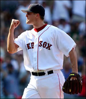
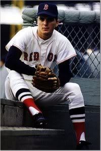
As Bill Hicks once said, "Four questions: Yeah? And? So? What?" On the far right, there's a photo of Jim Lonborg was the ace pitcher for the Boston Red Sox 40 years ago in 1967, their Impossible Dream season. His uniform is virtually identical, not withstanding the high pants cuff, to what current Red Sox pitcher Jon Papelbon wears today. (True, the Red Sox had a different uniform in the 1970s, but it was the '70s and the lettering on the jerseys remained the same.)

It would be the same if you put a picture of a 1967 Yankee next to a picture of Mariano Rivera, of a picture of Bart Starr in a Green Bay Packers uniform from 1967 next to Brett Favre. The best baseball uniforms -- such as the L.A. Dodgers, San Francisco Giants, St. Louis Cardinals -- are the ones that keep the basic look the same across the years.

So yes, Bud Selig, who always looks like he forgot to take the hanger out of his suit coat, has more fashion sense than Gary Bettman.

(Over at Mirtle, they're up in arms.)

Related:
New look befits NHL money-grab culture (Ed Willes, Vancouver Province)

UP AT 6: BLOND AMBITION LEAVES AVERY SQUEEZING HIS STICK

Now that it's OK to admit you can't find the Iraq on a map...

  • If a picture is worth a thousand words, the one of Mattias Ohlund at the Vancouver Canucks jersey unveiling is saying, "I'm so sorry," 333 times in succession.

    The feedback at the local Times-Colonist suggested the Canucks could have picked any one of the fake jersey prototypes (like the one on the right) that were floating around the web last winter and received a better reaction.

    -- "I felt embarrassed for (Markus) Naslund, (Trevor) Linden, etc. No way you could be excited to play in that jersey.."
    -- "That is the ugliest combination of the two ugliest uniforms they have ever had."
    -- "It's obvious that they DON'T listen to the fans at all! We all wanted them to just go with the Stick & Rink Retro jersey as they full time uniform, but they couldn't do it."

    Remember back in the early '90s when the NFL's San Francisco 49ers proposed a new helmet design that was so poorly received they scrapped it? Maybe NHL teams could have that ear to the ground like that -- never mind!

  • Good on Perdita Felicien for her medal in 100 hurdles at the track and field worlds. Like any true Canadian, she took a victory lap after winning the silver medal.
  • Apparently Ms. Famous For Being Famous is little more discriminating than the puckbunnies Sean Avery would have encountered when he was playing junior for the Kingston Frontenacs:

    "Sean Avery has just split from his fiancée, 24 star Elisha Cuthbert, a close friend of Paris', and was keen to try his luck with the hotel heiress at Amy Sacco's LG House party in Malibu.


    "A source told the New York
    Daily News newspaper: 'He hit on her three times, but every time, Paris would give him disgusted looks and move away from his creepy shoulder-brushing and close-talking ways.

    "Then he tried hitting on other blondes. You could tell he just wanted to hook up."
    -- LondonNet

    Creepy shoulder-brushing and close-talking? Sean Avery is a regular Casanova compared to some jocks.

    A hockey player who's open to dating any kind of woman, as long as she's blond, who knew? The normal impulse is not to touch this with a composite stick, but protocol is waived when it's Sean Avery. (As for the pic: We like Elisha a lot more than P.H.)
  • Count Dave Feschuk of the Toronto Star as another advocate for a shorter hockey season.
  • CFL: The Eskimos' A.J. Gass gets his suspension lifted in time for the Labour Day game vs. Calgary, just in case anyone forgot that Edmonton runs the league.

That's all for now. Send your thoughts to neatesager@yahoo.ca.