 The Paper of Record giving prominent play to the Ottawa Rapidz and manager Ed Nottle in its Sunday sports section is encouraging. The fallout from changing the name and logo less than a month out from Opening Day? Not so much.
Here's a sampling from this site, some e-mails and from Carl Kiiffner's Unofficial Ottawa Rapids Blog:
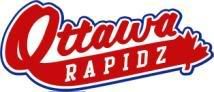
UPDATE: Carl's running a poll on which logo people prefer."When I saw this post, the logo in particular, I couldn't believe it. Still don't."
"Sorry, Rapidzzzz can't translate very well into French (remember the radio deal with CJRC and that 25% of your market is francophone). If that's the logo, hope they don't intend to print too many T-shirts. I was really positive on the Can-Am, but already this operation seems bush league. My interest is quickly turning into Zip, as in Zero…""How could anyone argue that the name and logo change, only two weeks before the start of spring training, is anything but a really dumb decision? With a fragile baseball market like Ottawa is, everything counts and the team cannot afford to make mistakes. I really hope I'm wrong but I'm really disapointed."
"... the name change might signal a change in approach in luring the folks on the 'Quebec side' to the stadium. If in fact this is the case I think it is a bad move. On the plus side, I guess it's a good sign that somebody bought it (the team)."
"I really hope you're kidding with that logo and name. That's brutal and given the fact that the Rapides were in Gatineau at the two (Olympiques) playoff games this week marketing to the French population and that the only radio they have right now is the 104,7 FM parlé, I hope that they do rethink the idea of the name and logo — which is lame."
"There is definitely a sense of slight, even betrayal. Hope this is not the first of many blunders."
"... it's a huuuuge step down from the old blue Rapids design. Loved the old design and was looking forward to buying a t-shirt/hat when the season started. Don't think I'll be doing that now. Maybe they ordered some merchandise already that they can sell at a discount."
"I pray that they will not actually spell the name of the team as 'Rapidz' (with a Z) on the uniforms. It's really not a subtle product placement (presuming that the Z is for Zip.ca), and it sure doesn't sound and look very credible to baseball fans. Would people in NYC allow the Yankees to be renamed the Yankeez?
"I have the same bad feeling about this as when the Gliebermans stepped in to save the Renegades a few years ago."
"Rapidz eh! What's next, Mardi Gras Weekends? Flaming R logo, or maybe they'll rename them the Steelbacks?"
"The 'blue splash' looks very professional and well done, I looked forward to outfitting my family of five in anything you could sell us. The red logo being circulated with the 'Z' and the Maple Leaf looks like my house league uniform from 1978! Oh, we’ll be there at the park, and of course a new owner can do what he wants, but surely something better is possible, even with the silly misspelling, the overused and cliché Maple Leaf and colour red, none of which have anything to do with water. Too bad, you've turned a home run into a real swing-and-a-miss."
"I cringed when I first read it, and I've cringed on every re-read. That being said, having a team with a lame, high-tech sounding name and spelling is better than having none at all. I keep telling myself that between cringes."
Man, it's like people in Ottawa have been scorched by sports operators before, or something. Perhaps Rick Anderson and Rob Hall could win people over if they open Monday's press conference at The Zip by promising to never put an actor in a Spartan costume.


4 comments:
Baseball - any league = zzzzzzzzzzzzzzzz
Obviously not, judging by the reaction this is receiving.
Hey, there's always Senators hockey availa... never mind.
This is just ridiculously sad.
The Rapidz. God almighty that's pathetic. They had such a great looking logo and everything.
It makes us glad that we canceled our Zip.ca subscription three years ago.
Here's hoping that it is just some marketing dweeb at Momentous who thought this was a good idea, and that they shoot it down quickly.
Post a Comment